
What is Website Accessibility?
Website accessibility refers to the ease of use of a website for individuals with disabilities. This can include people who are blind or have low vision, those who are deaf or hard of hearing, and those who may have mobility impairments or cognitive disabilities.
Why Does Accessibility Matter (besides the obvious principle of being decent)?
Besides being decent and not further marginalizing the disabled community, a readily apparent reason to make your website accessible is so your site can attract as many users as possible—since more visitors typically equate to more business.
Recent statistics show that over 15% of people worldwide are currently living with a disability.
Additionally, it’s the law.
As a website owner, you must ensure that you aren’t excluding any categories of people. The Americans with Disabilities Act – a civil rights law in the US – prevents businesses from discriminating against people based on disability status.
And since web accessibility is a legal requirement in many countries, if websites and online content fail to meet guidelines for compatibility with impaired users’ access needs, then companies may be prosecuted.
The World Wide Web Consortium (W3C) laid out the guidelines above in the Web Content Accessibility Guidelines (WCAG).
Essentially, these guidelines are standards that web developers, designers, and website owners should utilize when creating and maintaining websites and online content.
Now that you’re armed with the knowledge of what website accessibility is and why it’s crucial to design your site so that it is accessible for everyone, we’ll share some basics for improving your site, as well as a couple of tools to make it as straightforward as possible.
Basic Accessibility Improvements
There are several measures you can implement to ensure that basic accessibility needs for your site are met:
- Choose a content management system that supports accessibility features.
Many content management systems (CMS) options are available for building your website. WordPress, Squarespace, and Wix are a few of the most common ones, but numerous others are available.
Once you find a CMS that meets your needs, make sure to choose a theme that is accessible. Consult the theme’s documentation for notes on accessibility and tips for creating accessible content and layouts for that theme. Be sure to follow these guidelines when selecting different modules, plugins, and widgets for your website.
- Use the correct headings when organizing the content on your site.
Those with vision impairment typically use screen readers to navigate the content on a website. By using headings (<h1>, <h2>, etc.) correctly, the content of your website will be much more easily interpreted by screen readers.
How to use headings:
- Only use <h1> for the primary title of the page or for the title of the website.
- Use headings and subheadings to indicate and organize your content structure.
- Refrain from skipping levels (going from <h1> to <h3>), as screen reader users will wonder if content is missing.
- Include ALT text for all images.
Make sure to provide alt text for images added to your site so screen readers can relay the information conveyed by the image. This is especially important for informative images (such as infographics and charts).
When writing the alt text, it should contain the message you wish to convey through that image, and if the image includes text, that text should be included in the description.
If an image on your site is used purely for decoration, you typically don’t want to include alt text as it could confuse a screen reader and take a user’s attention away from key information on the page.
- Describe your links.
Visually-impaired people often use their screen readers to scan for links on a page. And since screen readers do not read links within the context of the rest of the page, using descriptive text for links helps adequately explain the context of links to the screen reader user.
So when including links in your content, make sure you’re describing where the link will take the user. By doing this, the user will know what they find on the other side and if it’s relevant to the information, they’re searching for.
This means that using “click here” is not considered a good link description and is often ineffective for a screen reader user.
For example, if you are pointing visitors to the”About Us” page:
- Try not to say: “Click here to read about our company.”
- Instead, say: “To learn more about our company, read About Us.”
- Beware of your color choices.
The most common form of color deficiency is a red-green color deficiency, and it affects approximately 8% of the population. Relying too heavily on these colors (especially to indicate required fields on forms) will make it difficult for these individuals to understand your message.
Other people with disabilities, particularly users with learning disabilities, can significantly benefit from color when used to differentiate and organize content.
To address the needs of both groups, you should use color, but you also need to use other visual indicators, such as asterisks or question marks. Also, ensure different blocks of content can be distinguished by using visual separation like whitespace or borders.
Additionally, inadequate color contrast can make it difficult for individuals with low vision or varying levels of color blindness to see elements on your webpage. So use contrasting colors wherever possible to highlight critical page features.
- Make audio and video content accessible for all.
Since videos and other multimedia elements can have a key role in increasing the user-engagement on your site, it’s important to make sure every user can access them.
While blind and visually-impaired users can’t see visuals, deaf users and those hard-of-hearing can’t hear audio.
So like with image alt text, you can use alt text or audio descriptions for videos so visually-impaired users can understand how the video supports the surrounding content.
For deaf and hard-of-hearing users, it’s critical to enable subtitles so they can follow along with videos or other sound elements on your webpage.
- Allow website users to enlarge font sizes on your site.
People with vision impairment often can’t read small text sizes—so, when they browse the web they often use specific font settings on their device so they can see the contents of a page.
One thing you can do to make this easier for them is to offer an alternate style sheet on your site with the ability to enlarge the font size without breaking your page layout. Additionally, it can be helpful for all users to just have larger font sizes on the most important page elements like buttons and CTAs.
And finally, if it’s possible when designing and branding your site, try to choose fonts that are easy to read and are low-vision or dyslexia friendly.
Accessibility Tools
One of the first tools at your disposal is an online accessibility checker like the WAVE Web Accessibility Evaluation Tool. One of the main ways this program checks your site is by comparing its compliance with accessibility standards, such as the WCAG mentioned above.
All you need to do to use the WAVE tool is to enter the URL of the webpage you want to evaluate and it will generate a report that shows any accessibility errors on that page.
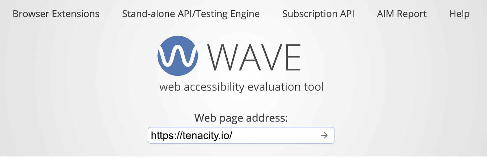
In addition to the error report, WAVE provides feedback on how to further enhance that page to increase accessibility.
Another option is to install a web browser extension that automatically checks for accessibility issues. A popular tool for Google Chrome is the Accessible Rich Internet Applications (ARIA) extension.
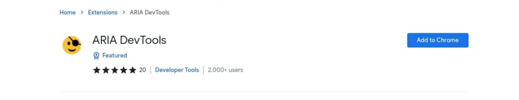
The ARIA extension is designed to improve the usability of web pages for people with disabilities and optimize those pages for use with assistive technologies such as screen readers.
If you are interested in knowing how well a website can be used by people who have certain disabilities or who access the internet with accessibility devices, there are tools for that as well.
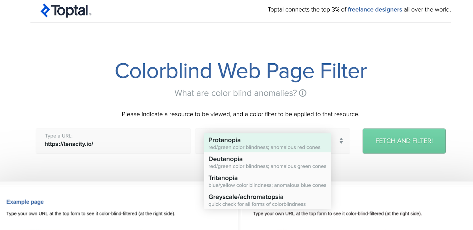
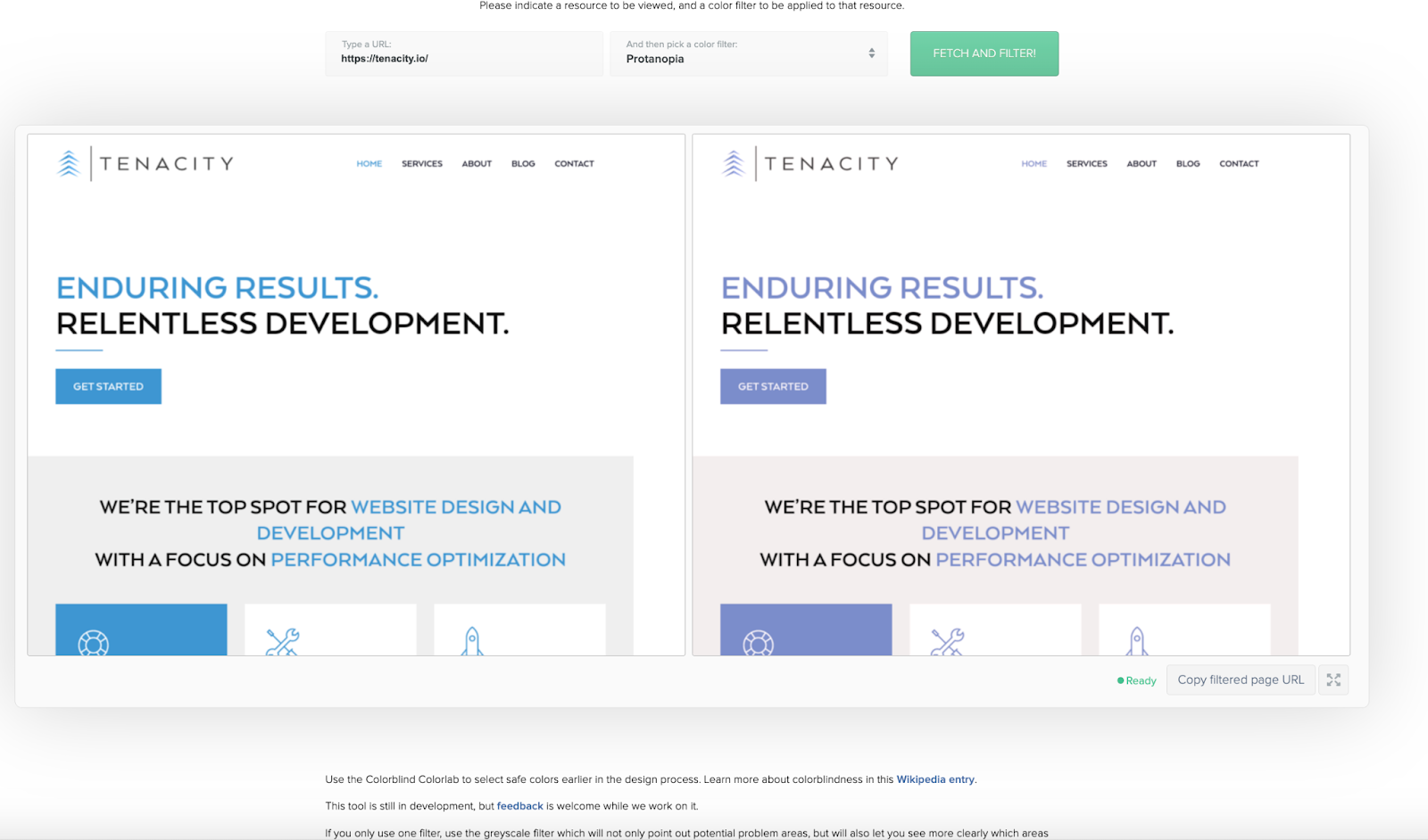
One tool we’ve found is the Toptal Colorblind Page Filter. This tool allows you to enter a URL into their search box, select a color-blindness filter, and then see what that webpage would look like to a person that has that specific color blindness. We tested our own homepage for example:
Results for our homepage:
If you are interested in knowing how your website is portrayed via screen reader, another tool you can use is BrowserStack. Though BrowserStack has many features, the one you should focus on is the screen reader ability.
By signing up for a free trial, you can then enter in a website URL and see how the site works with a screen reader on nearly any browser.
All of this to say that there are so many tools are available to check accessibility in addition to the free options above, so go ahead and browse for a solution that works best for you.
To Conclude
Right now, 90 percent of public-facing websites are not fully accessible to people who use assistive technology devices. But creating an accessible site doesn’t have to be difficult or time-consuming.
By following the steps above and using the right tools, you can significantly improve the accessibility of your site. Doing this broadens your customer base, and contributes to the overall availability and ease of access to important online resources everybody needs!
Please feel free to comment below if you have thoughts or advice for us on website accessibility. Or, if you would like some guidance with accessibility on your website, you can reach out to us anytime!
Sources:
Top 10 Tips for Making Your Website Accessible | Web Access
How to Design an Accessible Website (A Complete Guide)
10 Ways to Improve Web Accessibility
WAVE Web Accessibility Evaluation Tools
Beyoncé’s company sued over the accessibility of her website
Web Accessibility Laws & Policies | Web Accessibility Initiative (WAI) | W3C
Web Content Accessibility Guidelines (WCAG) 2.1
How to Incorporate Accessibility in Your Website
Accessible fonts: How to choose a font for web accessibility