
A 0.5% improvement in conversion rate doesn’t sound impressive until you do the math. For a site with 100,000 monthly visitors and a $50 average order value, that half-percent equals an extra $25,000 in monthly revenue. Over a year, that’s $300,000, the cost of several employees or an entire marketing campaign.
These marginal gains separate effective designers from decorative ones. Using analytics to guide design decisions transforms subjective preferences into objective evidence and opinions into outcomes.
When Intuition Misleads
We all have opinions. We think we know what users want. But the truth is, our assumptions are often wrong. What seems intuitive to us might be a complete roadblock for someone else. Analytics cuts through these assumptions with objective evidence of user behavior, revealing what’s actually happening on your site, not what you think is happening.
Think about it this way: if you’re building a house, you don’t just guess where the doors and windows should go. You use blueprints, measurements, and structural data. Web design is no different. Your analytics are your blueprints.
What to Track and Why it Matters
So, what kind of data should you be looking at? We’ll highlight a few critical metrics and how they can guide your design choices:
Bounce Rate: This is the percentage of visitors who navigate away from your site after viewing only one page. A high bounce rate often indicates that your landing page isn’t meeting user expectations. While this varies by industry, a benchmark from Semrush suggests a bounce rate between 41% and 55% is considered average. If your numbers are creeping above 70%, it’s a strong signal that you need to re-evaluate your page’s design and content.
Engagement time (GA4). Shows how long users actively interact with a page. Low engagement may signal content density or readability issues. Fix with clearer headings, shorter paragraphs, and visual cues such as summaries and callouts.
Conversion Rate: Whether signing up for a newsletter, making a purchase, or filling out a form, your conversion rate measures the percentage of users who complete a desired action. This is one of the most critical metrics. To give you some context, the average global e-commerce conversion rate hovers around 2.86%, according to IRP Commerce. This means even small design tweaks that improve usability and bump your rate by a fraction of a percent can result in significant revenue growth. If your conversion rate is low, it points to friction in your conversion funnel.
Click-Through Rate (CTR): This measures how often users click on a specific link or call to action. A low CTR on a critical button suggests it might be poorly placed, not visually prominent enough, or the accompanying text isn’t persuasive. Heatmaps and scroll maps can be incredibly useful to see where users are clicking and where they aren’t.
Device Usage: Are most of your users on mobile, tablet, or desktop? Statista data from Q2 – 2025 shows that mobile devices (excluding tablets) generated nearly 63% of global website traffic. For many B2B audiences, desktop still dominates during work hours, so optimize to your mix: design for touch (larger targets, thumb-friendly nav), optimize forms for mobile keyboards, test funnels on real devices, and validate desktop flows for multi-step tasks like pricing, admin, and checkout/demo forms.
User Flow/Navigation Paths: Understanding how users move through your site reveals how intuitive your navigation is. Are they finding key pages easily, or are they getting lost? If users are consistently dropping off at a particular point in a multi-step process, that’s a red flag indicating a design flaw that needs attention. Visualizing user flow can highlight unexpected paths or areas of confusion.
Accessibility & Inclusivity: Data-informed design includes accessibility. Track and fix issues that block users from completing tasks. Check: contrast, focus order, keyboard traps, and form error clarity. Accessibility improvements often raise conversions and reduce support load.
If you’re feeling overwhelmed by all these metrics, you’re not alone. Many designers worry that focusing on data will stifle creativity or turn design into a paint-by-numbers exercise. But here’s what happens: data reveals where users struggle, and creativity solves those problems. The numbers tell you what to fix; your design skills determine how to fix it.
From Analytics to Action
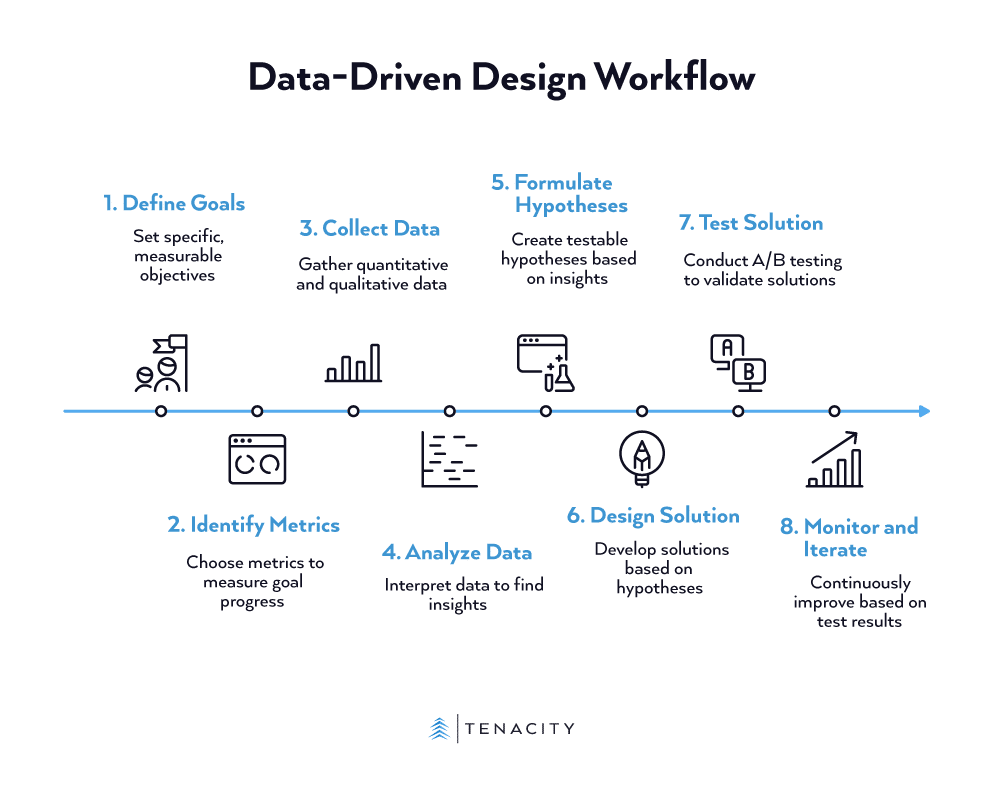
The goal isn’t to let data dictate every pixel. It’s about using data to inform your creative choices. Here is a more detailed workflow:
- Define Your Goals: Start with specific, measurable goals tied to business objectives. Instead of a vague goal like “improve the homepage,” aim for something concrete like “increase sign-ups from the homepage by 10%.”
- Identify Key Metrics: Choose the metrics that directly measure your goals. For the goal above, your key metric is the conversion rate of the homepage sign-up form. This keeps your analysis focused.
- Collect Data: Use tools like Google Analytics for quantitative data (the numbers) and platforms like Microsoft Clarity for qualitative data (heatmaps, session recordings). Establish a baseline measurement before you make any changes. Remember to check legal/IT policies, mask fields, and respect consent.
- Analyze and Interpret: Dive into the data to find the story. Where are users dropping off in the funnel? Which elements are they ignoring? This is where you identify the problems that need a design solution.
- Formulate Hypotheses: Turn your insights into testable hypotheses. A good hypothesis follows an “If… then… because…” structure. For example, “If we change the sign-up button color to a higher contrast, then the conversion rate will increase because the button will be more visually prominent.”
- Design and Implement: Now you design. But instead of guessing, you are creating a solution for a specific, data-identified problem based on a clear hypothesis.
- Test (A/B Testing): This step separates assumptions from proof. Use A/B testing to show your new design (Variant B) to a segment of your audience while showing the original (Variant A) to another. Randomized experiments (A/B or multivariate) are the strongest way to prove that your change caused the resulting improvement.
- Monitor and Iterate: Design is not a one-time project; it’s a continuous cycle of improvement. Whether your test succeeds or fails, you’ve learned something. Focus your next test on the highest-traffic pages with the biggest conversion gaps; small improvements on high-volume pages deliver the most impact. Use those results to inform your next hypothesis and start the loop again.
A Quick Word on Data Quality
As you start testing, watch out for three common pitfalls: correlation vs. causation (your bounce rate might have dropped because of a marketing campaign, not your design change), insufficient sample size (don’t call a test with 50 visitors), and seasonal variations (traffic patterns shift during holidays, back-to-school, etc.). Most A/B testing tools will flag statistical significance for you, but as a rule of thumb, run tests for at least two full weeks and wait until you have several hundred conversions per variant before making decisions.
Design with Proof In Mind
Embracing data does not diminish your creativity; it empowers it. It transforms you from a designer who makes things look good into a strategic problem-solver who creates effective experiences. The best part? You don’t need to become a data scientist to see results.
By grounding your creative instincts in objective evidence, you can design with confidence, build better products for your users, and deliver tangible results for your stakeholders. This week, open your analytics dashboard and identify one underperforming page. That’s where your first test begins.
Ready to move faster? Whether you’re setting up your analytics framework or running your first A/B tests, we can help you move from intuition to evidence. Let’s talk about your conversion goals.
Sources:
- What Is Bounce Rate? And How to Reduce It | SEM Rush
- Top websites worldwide – statistics & facts | Statista
- E-commerce Statistics, Trends, and Insights for 2024 | Tamarind’s B2B House
- Ecommerce Market Data and Ecommerce Benchmarks for August 2025 | IRP Commerce
- What is conversion rate optimization (CRO)? | Optimizely
- 20 website metrics to track for success | Optimizely
- Website Performance Metrics: The Complete Guide | Amplitude