
Your ads are working. The clicks are pouring in. So why is your ROI flatlining? The hard truth is that clicks don’t pay the bills, conversions do. And all too often, that expensive, high-intent traffic is being sent to the one place guaranteed to kill momentum: your company homepage.
All too often, I see well-funded campaigns send high-intent traffic to one place: the company homepage. While your homepage is essential for introducing the brand and general exploration, it’s a terrible destination for focused campaign traffic.
On the other hand, a landing page is a standalone page designed for a specific purpose, like capturing leads or promoting a campaign, and is often linked from external sources.
Put more simply: Your homepage is a directory. It’s designed for exploration. Your landing page is a specialist. It’s designed for a single purpose: conversion.
For anyone serious about digital marketing, understanding this distinction is the difference between a phenomenal ROI and a campaign that bleeds money. A dedicated landing page is your 24/7 salesperson, relentlessly focused on a single objective. It meets the user exactly where they are, acknowledges the promise of the ad they just clicked, and guides them seamlessly toward a desired action.
The Numbers Don’t Lie: Some Data Behind Dedicated Landing Pages
Not convinced? Let’s look at the data. The marketing world runs on metrics, and the statistics on landing pages paint a very clear picture of their importance:
- Conversion Rates Vary, But Opportunity is High: While the median conversion rate for a landing page across all industries is about 6.6%, this number changes dramatically based on the industry and offer. For example, events and entertainment can see rates as high as 12.3%, while SaaS is lower at 3.8%. This shows that there is always room for improvement and optimization.
- More Landing Pages = More Leads: Businesses with 10-15 landing pages see a 55% increase in leads compared to those with fewer than 10. The benefits scale dramatically from there, with some studies showing that companies with 40 or more landing pages generate over 500% more leads.
The Pieces and Parts of a Successful Landing Page
Think of your landing page as a persuasive argument, presented in seconds. Every element must work in harmony to build trust and drive action. If you’re building a new one or auditing a current page, ensure these seven elements are optimized to perfection.
1. The Headline & Sub-Headline Duo
This is your first impression, and it has about three seconds to do its job. Your headline must immediately connect with the ad the visitor clicked on and state your core value proposition. The sub-headline can expand on this, offering more detail or a compelling benefit.
- Bad: “Acme Corp Services”
- Good: “Effortless Project Management for Growing Agencies”
- Sub-headline: “Stop juggling spreadsheets and start delivering projects on time, every time. Get your free 14-day trial.”
2. The “Hero Shot”
This is your primary visual element: a high-quality image or short video. Don’t use generic stock photos. Show your product in action or a smiling customer who represents the successful outcome of your offer. If it’s a service, use a diagram or a visual that represents that same success. The hero shot should help them envision their own success and make the abstract benefits of your offer feel tangible and real.
- Video is a Conversion Machine: Including a video on your landing page can increase conversions by up to 86%. With attention spans getting progressively shorter, a compelling video can communicate value far more quickly than text alone.
3. Compelling, Scannable Copy
Your visitor isn’t here to read a novel. They are here to solve a problem.
- Focus on Benefits, Not Just Features: Instead of saying “Our software has a 128-bit encryption feature,” say “Keep your client data secure and protected with military-grade encryption.”
- Use Bullet Points: Break down complex information into easily digestible chunks.
- Speak Directly to the User: Use “You” and “Your” to make the copy personal and address their pain points.
4. Social Proof: The Ultimate Trust Signal
Why should a visitor trust you? Because others already do. Social proof is non-negotiable for building credibility and reducing conversion anxiety. This can include:
- Customer testimonials (with names and photos, if possible)
- Logos of well-known companies you’ve worked with
- Star ratings and review counts (e.g., “Rated 4.9/5 by 1,200+ users”)
- Case study snippets or links
5. The Irresistible Call-to-Action (CTA)
This is the moment of truth. Your CTA button must be the page’s most visually prominent element.
- Use Action-Oriented Language: Go beyond “Submit.” Use “Get Your Free Quote,” “Download the Guide,” or “Start My Trial.”
- Make it Stand Out: Use a contrasting color that draws the eye.
- Place it Strategically: If it’s long, have it above the fold and then repeat it further down the page.
- A Single Goal is Crucial: Multiple offers on a single landing page can be a conversion killer, reducing conversions by up to 266% in some cases. A focused page with a clear call-to-action (CTA) respects the user’s journey and avoids decision paralysis.
6. The Frictionless Form
If your goal is lead generation, the form is your finish line. The golden rule is to only ask for what you absolutely need. Every additional field you add increases friction and can cause users to abandon the page. The effort required to fill out the form must be proportional to the value of the offer. A simple newsletter signup needs an email address. A detailed B2B quote request might warrant a few more fields.
- The “Less is More” Rule for Forms: When it comes to the lead capture form, brevity is key. The ideal number of form fields is generally considered to be three. Research shows that personalized calls-to-action (CTAs) convert 42% more visitors than generic ones.
7. The Absence of Distraction
This might be the most important, and most overlooked, element. A true landing page has no main site navigation. There are no links to your “About Us” page, blog, or careers section. Removing all exits except your CTA isn’t a design choice; it’s a strategic imperative. You’ve paid for that click; the last thing you want is for the user to wander off. The only clickable paths should be the CTA and perhaps a link to your privacy policy.
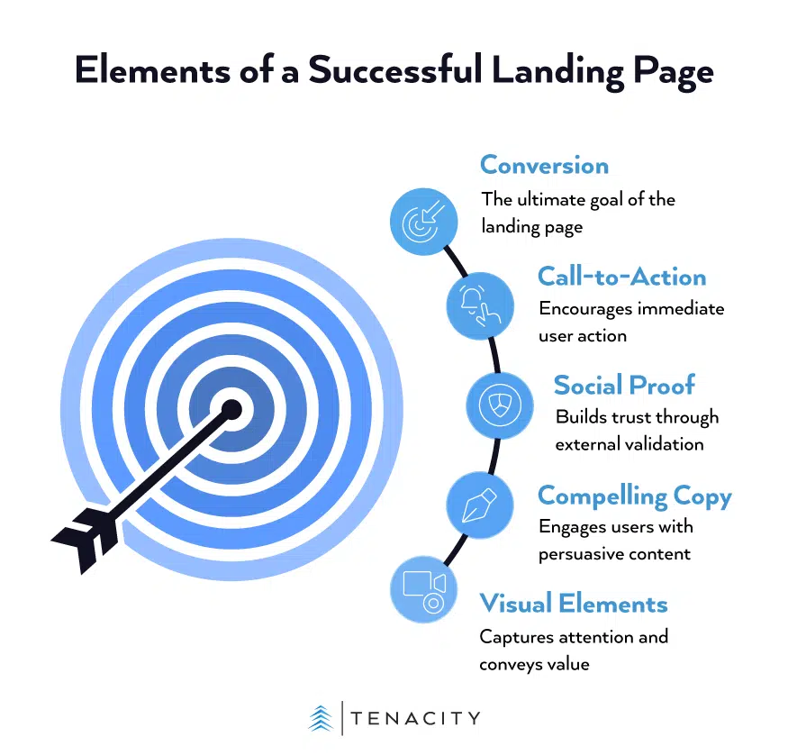
The Bottom Line
A landing page isn’t just another page on your website; it’s a critical component of your marketing engine. It respects the user’s time and intent, providing a clear, focused path from click to conversion.
The simple formula for Conversion Rate (CR) is a testament to this focus:
CR=(Number of Conversions/Total Visitors)×100%
By optimizing the elements above, you are directly influencing the numerator of this equation. You’re turning more of those expensive clicks into tangible business results. Stop sending campaign traffic to your homepage. Build a dedicated, optimized landing page and watch your ROI soar.
Ready to maximize your landing page conversions? Contact us today to get a free landing page assessment and start seeing real results.
Sources:
- Landing page vs homepage vs website: What’s the difference? | Unbounce
- 7 Essential Landing Page Elements You Need to Have | HubSpot
- The Anatomy of a Landing Page [Includes Illustrations] | Unbounce
- The anatomy of a landing page: 9 essential elements with examples | Wix
- What Makes a Good Landing Page? | Constant Contact
- What are the Key Components of a Landing Page? | Apexure
- Landing Page Optimization | Semrush
- What is the average landing page conversion rate? (Q4 2024 data) | Unbounce
- Why You Need to Create More Landing Pages [Data + Tips] | HubSpot
- Can Product Videos Boost Conversions? [With Stats] | Gumlet
- 30 Call-to-Action Statistics for 2025: CTA Stats to Know | Sixth City Marketing
- 10 Landing Page Tactics That Will Turn Casual Visitors into Converting Customers | Quick Sprout